The golden ratio is a math formula that exists in nature and have been adopted in designs since its discovery. There are patterns in natural objects including the sculpture of human looks that can be backed by this formula.
At first glance, it might seem odd that aesthetic is being defined by a math formula. And as a developer, when I got a aware of the concept through my design explorations, I failed to believe or accept it was practicable. I had thought people just pasted the golden spiral on designs to make a meaning out of nothing. That might be the case for you now but I’ll try to work you through my journey of comprehending the concept.
First, what is the golden ratio? mathematically, it is the representation of two quantities with the same ratio as the ratio of their sum to the larger of both quantites.
The golden ratio is represented with φ (phi) which can also be used as its mathematical constant 1.618 also known as the golden number. If you care about the math, check wikipedia.
Since we’re here to talk about design and aesthetics, let’s start with the least technical - Natural Beauty. I mentioned earlier that patterns of the golden ratio can be found in human beauty and in the natural things around us. Studies of attractiveness have backed up the theory of the existence of golden ratio in the facial construct of humans. Here is a video that illustrates that
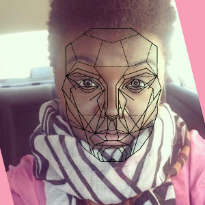
while research still shows that beauty is not solely based on phi, we can try to recreate a face in the wrong proportions or an off-ratio and we will end up with something ugly. Something that a malformed person might look like after an accident. But there are people who aren’t considered attractive and yet haven’t been malformed in any form of accident. In most cases, their faces might still be in the precise golden ratio, but they might not be sculpted well enough to fit other beauty metrics. The marquardt beauty pentagon is an example of one of such metrics and here is my wife placed behind the pentagon mask. It fits nicely because she’s gorgeous.

While you may argue that beauty is in the eye of the beholder, I can counter that argument by saying we all have various retina definitions that makes the pattern more prominent when we observe some people, more than when we observe others. But if you would insist there is no logic or principle attached to beauty, that’s fine too. It is worth noting that a beautiful face might not be perfectly symmetrical. As simple as human beauty analysis can be, it can also get really complex so I will move on to plants.
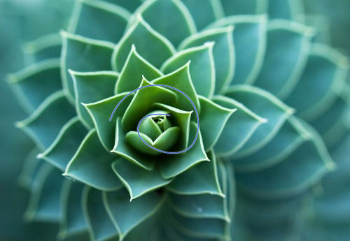
Plants have been known to have a physical/aesthetic illustration of the fibonacci series and with the relationship between fibonacci and golden ratio, we can begin to see how both can be observed in the natural layout of leaves, flowers, and trees.
The spiral on the leaves shows the ascending sequence of fibonacci. In numerals that is 1, 1, 2, 3, 5, 8, 13, 21, …, where every 2 preceding numbers make up the next number. You might even apply pascal’s triangle in analyzing the beauty of a subject.
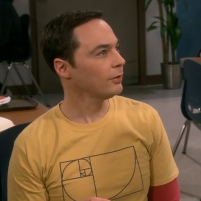
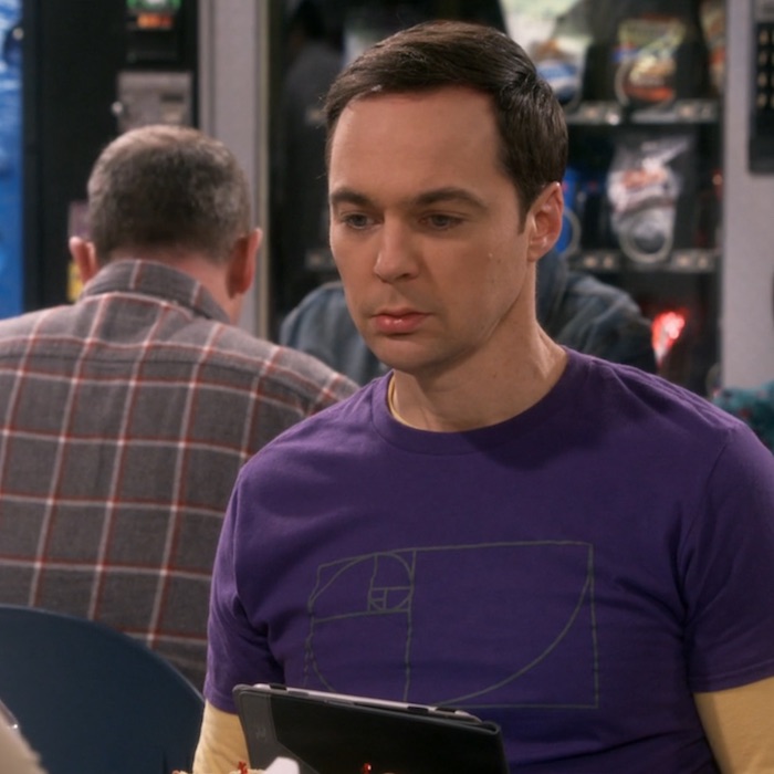
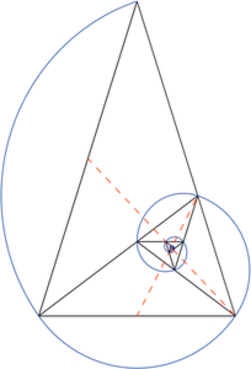
Logo designers achieve precision with their logos with the use of golden circles. To derive that, the golden spiral is made to pan a golden rectangle with smaller rectangles making up the fibonacci series. This can also be achieved with triangles as shown:

The video below shows the derivation of stunning logos through the circles derived from the spirals.
I love logos and designing them have gradually become a part of what I do along with software development. Here are some logos in the wild with good use of the golden ratio:
If you choose to apply the golden ratio to logos you make, you shouldn’t bother about the detail from the start. It is always fine to make a simple sketch and then try to derive the circles on it. When making animal logos or logos from other existing objects, it is a little more straigth-forward to just begin deriving circles from the original images.
Rule of thirds
The golden ratio extends to fields of photography and film-making. It obviously should since it is evident in us and the things around us and these fields are centered around capturing live physical events or simulating them. The rule of thirds is a guideline in cropping or positioning cameras against the subject for aesthetic results. Here is a good video on composition and cinematography that explains this in detail
Back to UI engineering, there is a lot learned from golden ratio that can be put into the way we build apps and websites. Additionally, the placement of hero images, illustrations, and call to actions can be guided by the principles of the rule of thirds. Here is an example of a webpage application:

Although hard to notice, the text placement abides by the rule of thirds.
Let’s go build some amazing products.